
Brand Identity / Data Visualization / Graphic Design
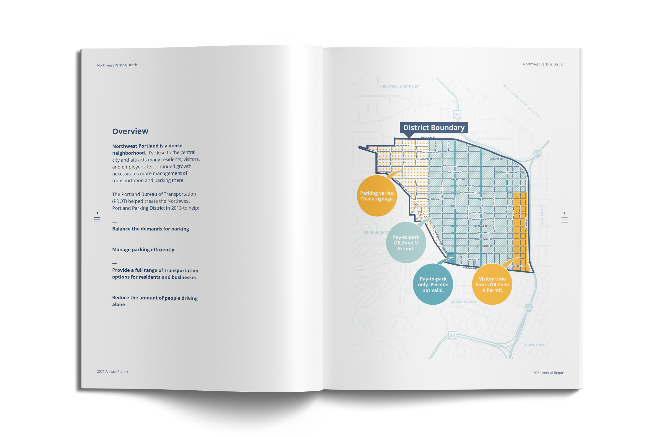
Northwest Portland is a dense urban neighborhood that attracts many residents, visitors, and employers. Its parking program charges for parking and invests in a range of transportation options for residents and businesses to reduce the amount of people driving alone.

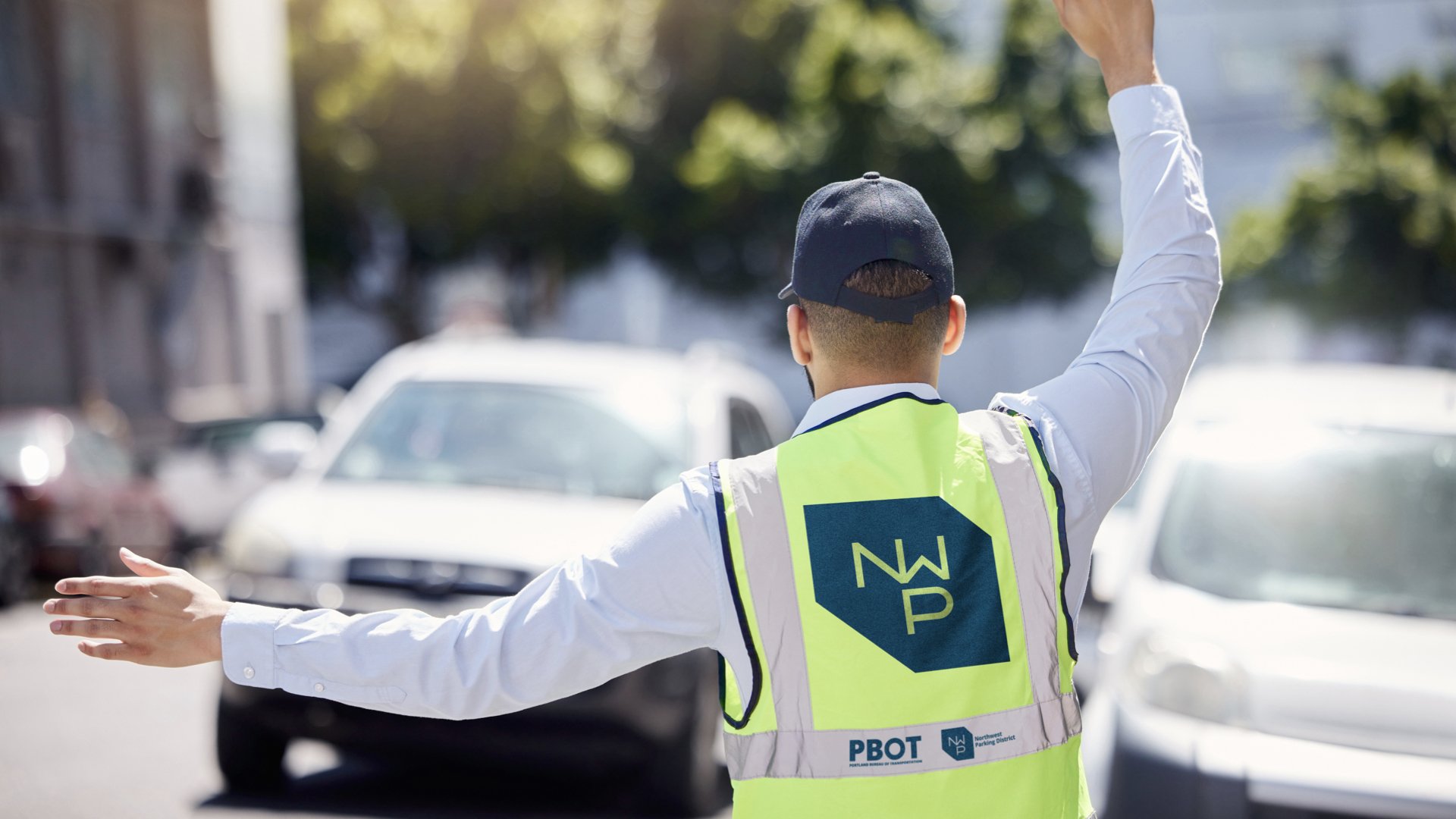
The Portland Bureau of Transportation asked sparks+sullivan to develop a logomark and brand system to create consistency and communicate that the Northwest Parking District does more than just manage parking.
The logo is inspired by the neighborhood, known for its walkable grid of streets, and its distinct overall shape, bordered by key corridors. The same neighborhood geography and street infrastructure people navigate is also the grid for the logomark.
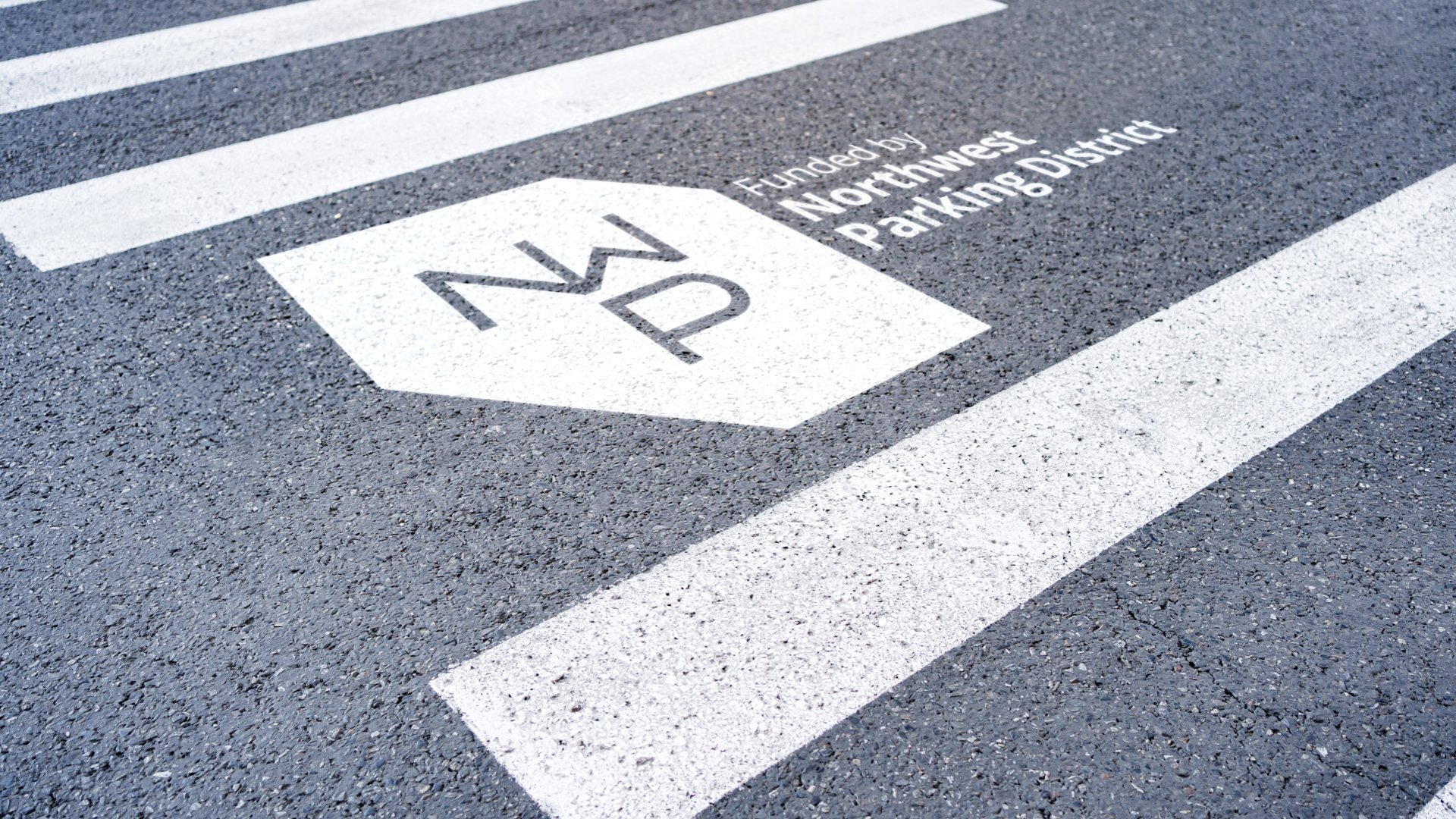

Drawn on the city grid, the logo highlights the letters “NW” representing Northwest, and integrates an abstract “P” underneath, symbolizing how parking supports the overall district.

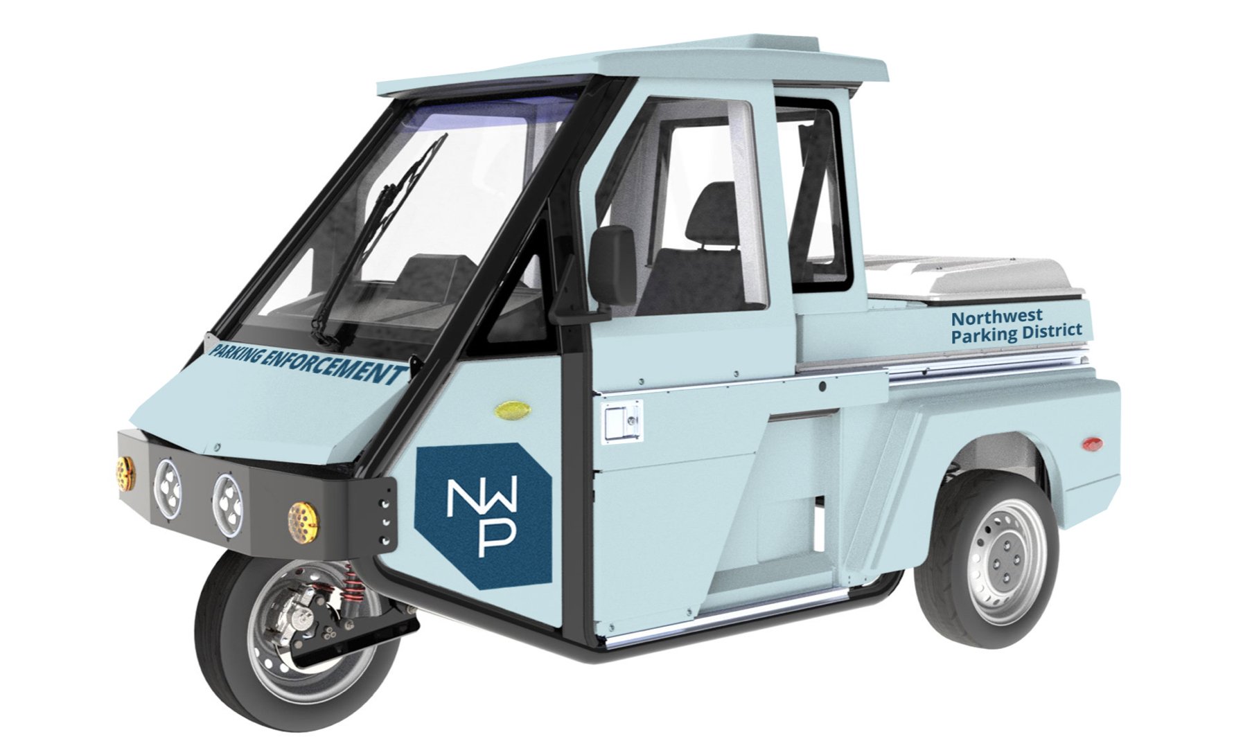
With the logomark established, we built out a full graphic identity system and applied it to several items including an annual report, project postcard notifications and even parking enforcement vehicles.


There are several Portland parking districts in addition to Northwest and there will likely be more as the City grows. The logomark was designed to anticipate this growth. The mark can be adapted—representing each district—while maintaining a recognizable aesthetic.
