Brand Strategy / Brand Identity / Graphic Design
As the largest college in Oregon, Portland Community College (PCC) offers high-quality, affordable education for students across four campuses. Their Rock Creek Campus and Sylvania Campus are undergoing major renovations that will significantly impact the campus experience.
At their Rock Creek campus, built in the 1970’s in rural Washington County, PCC is planning to renovate its largest building and construct additional buildings.
We developed a brand and communication plan to invite participation and share design work as it develops.
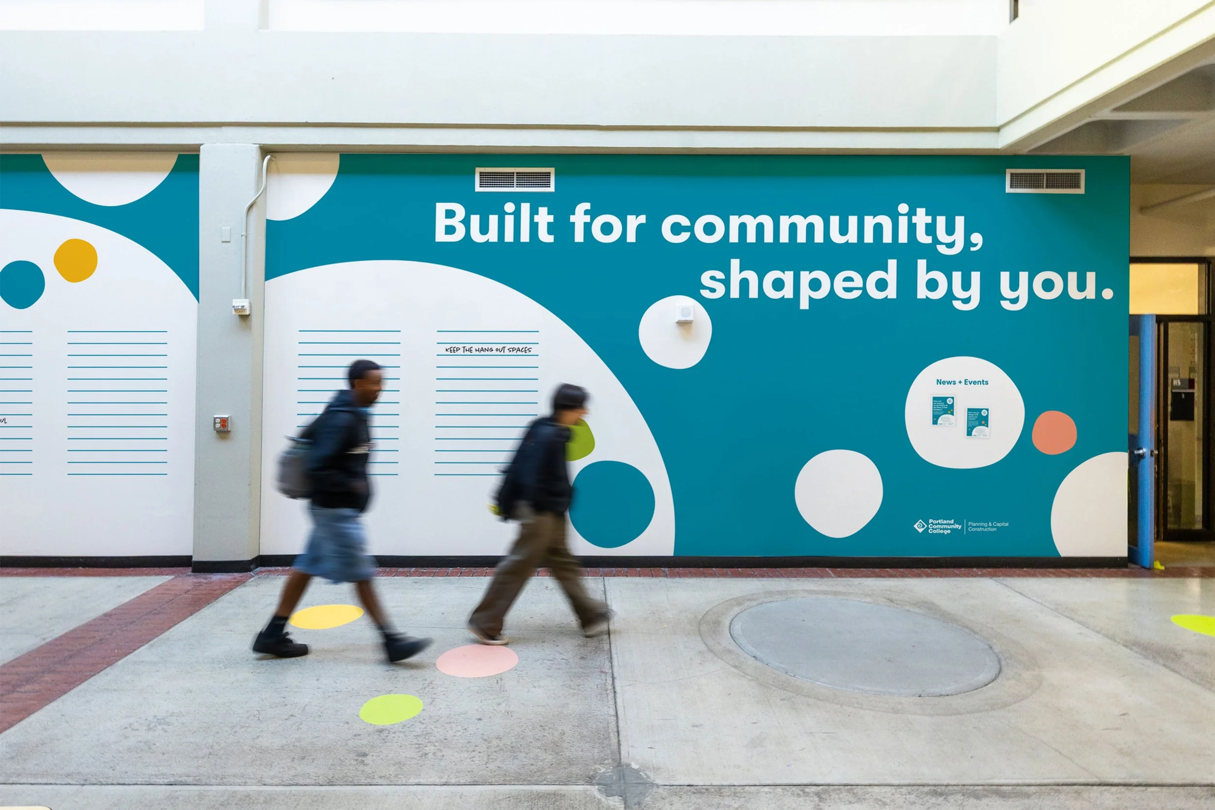
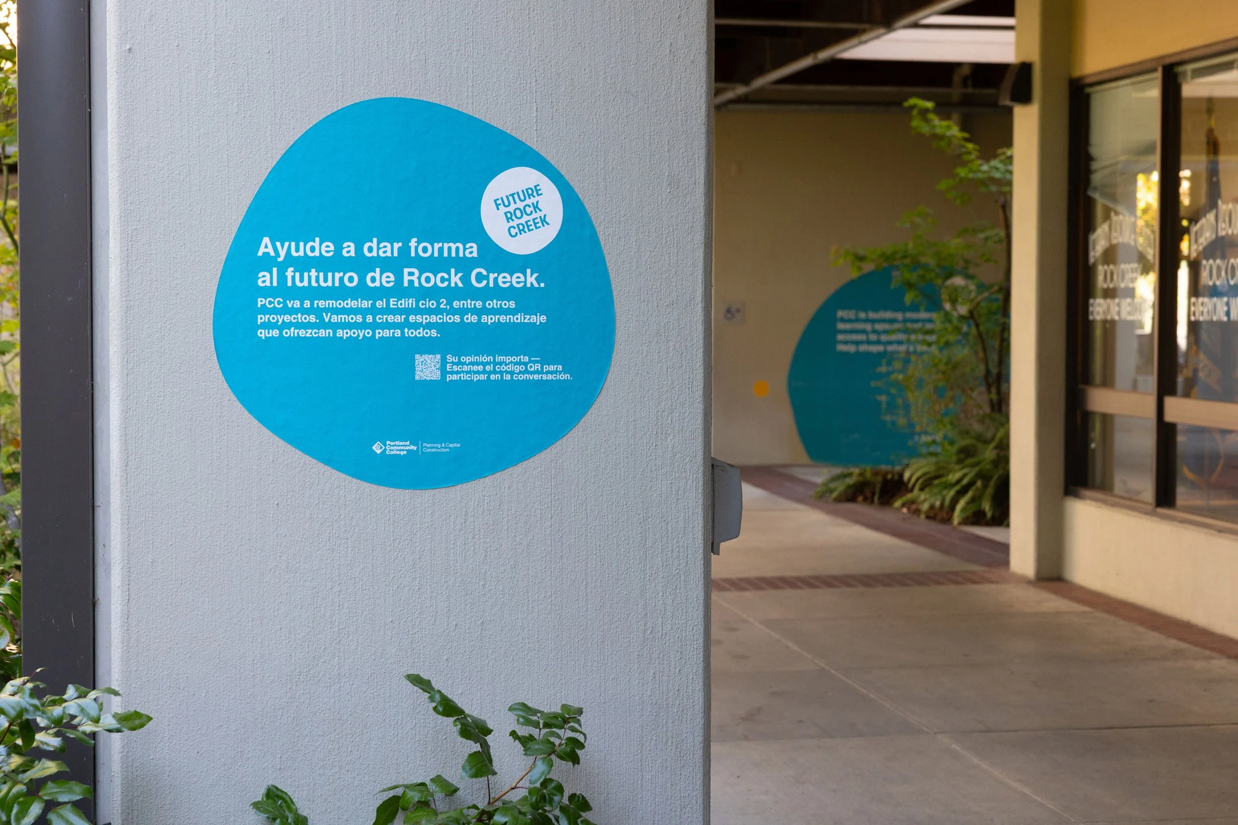
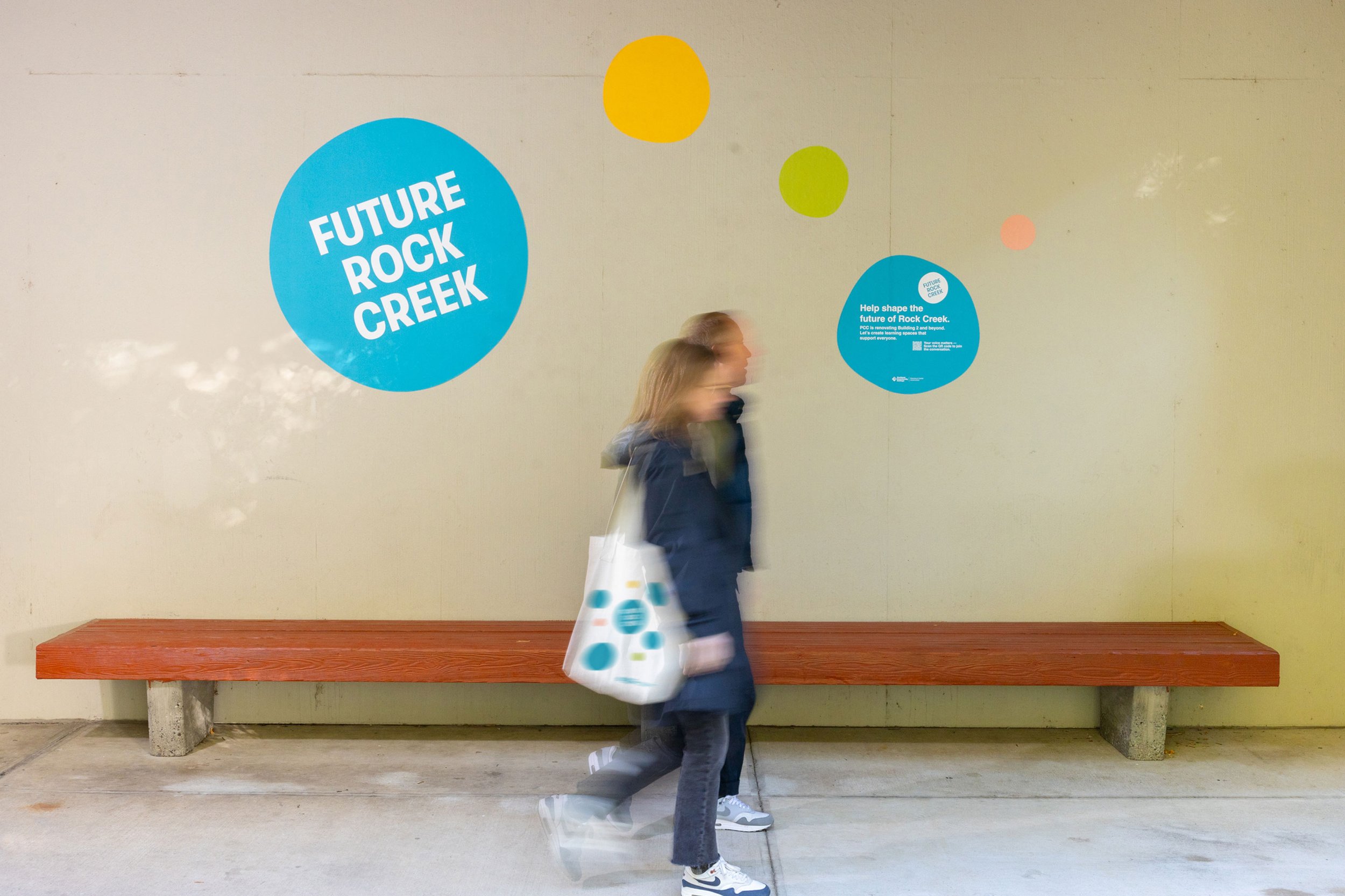
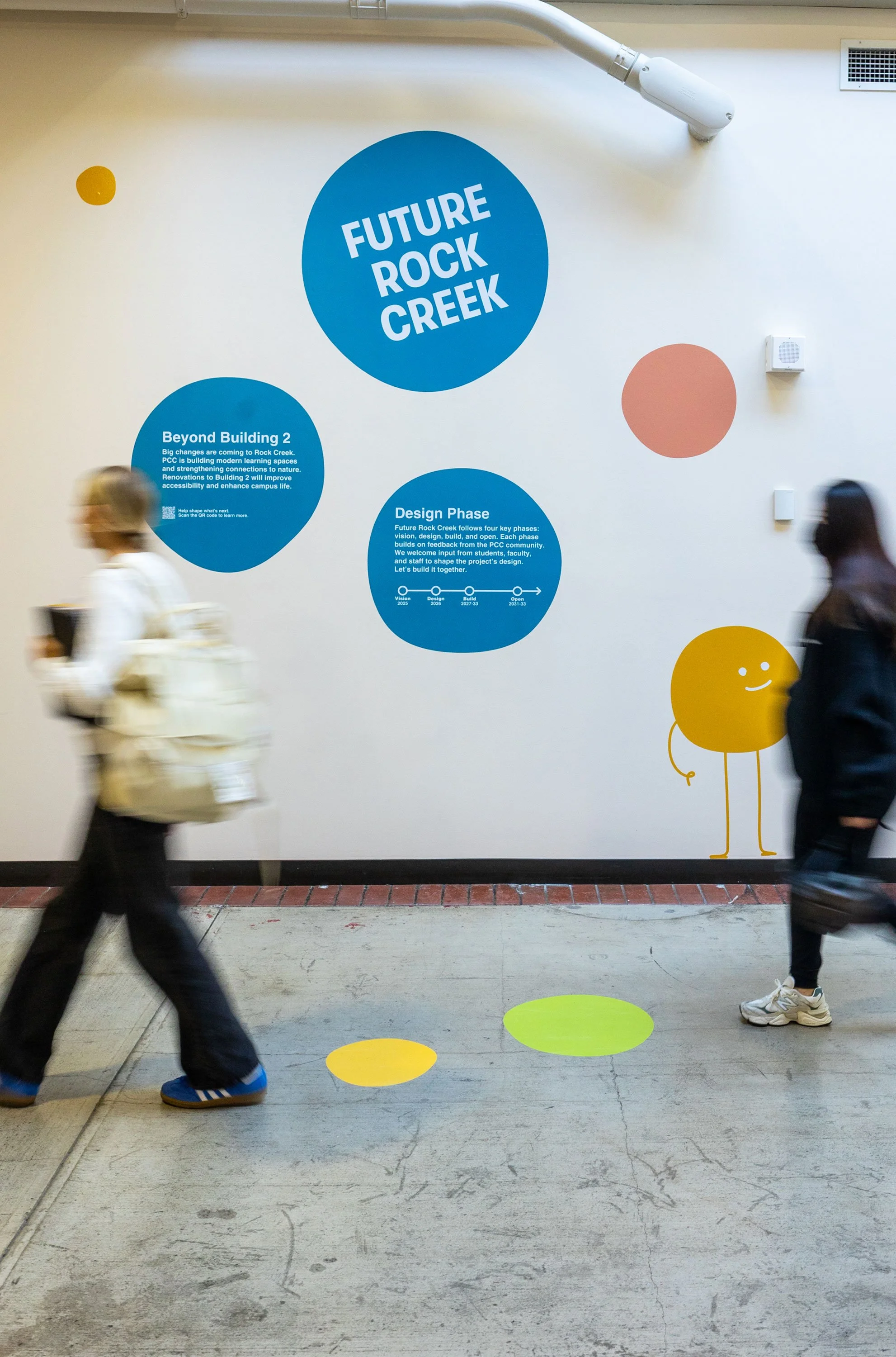
Walking through campus you’ll notice playful colored dots installed around entrances, walkways, and stairwells.
They mark locations that will be impacted by the renovations—intuitively communicating positive future changes.
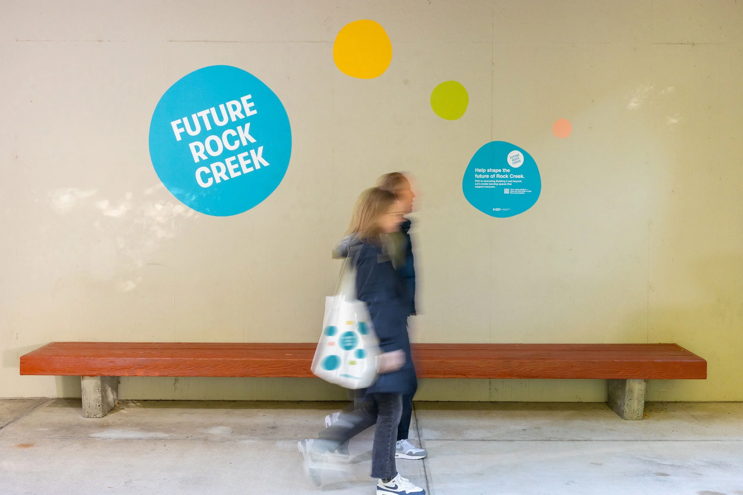
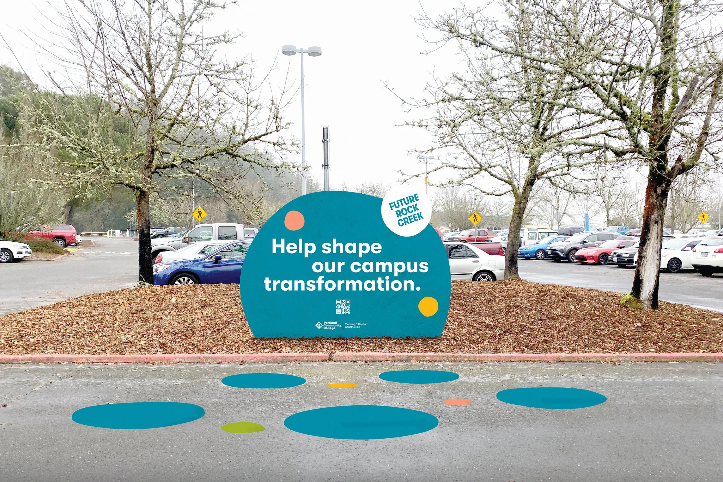
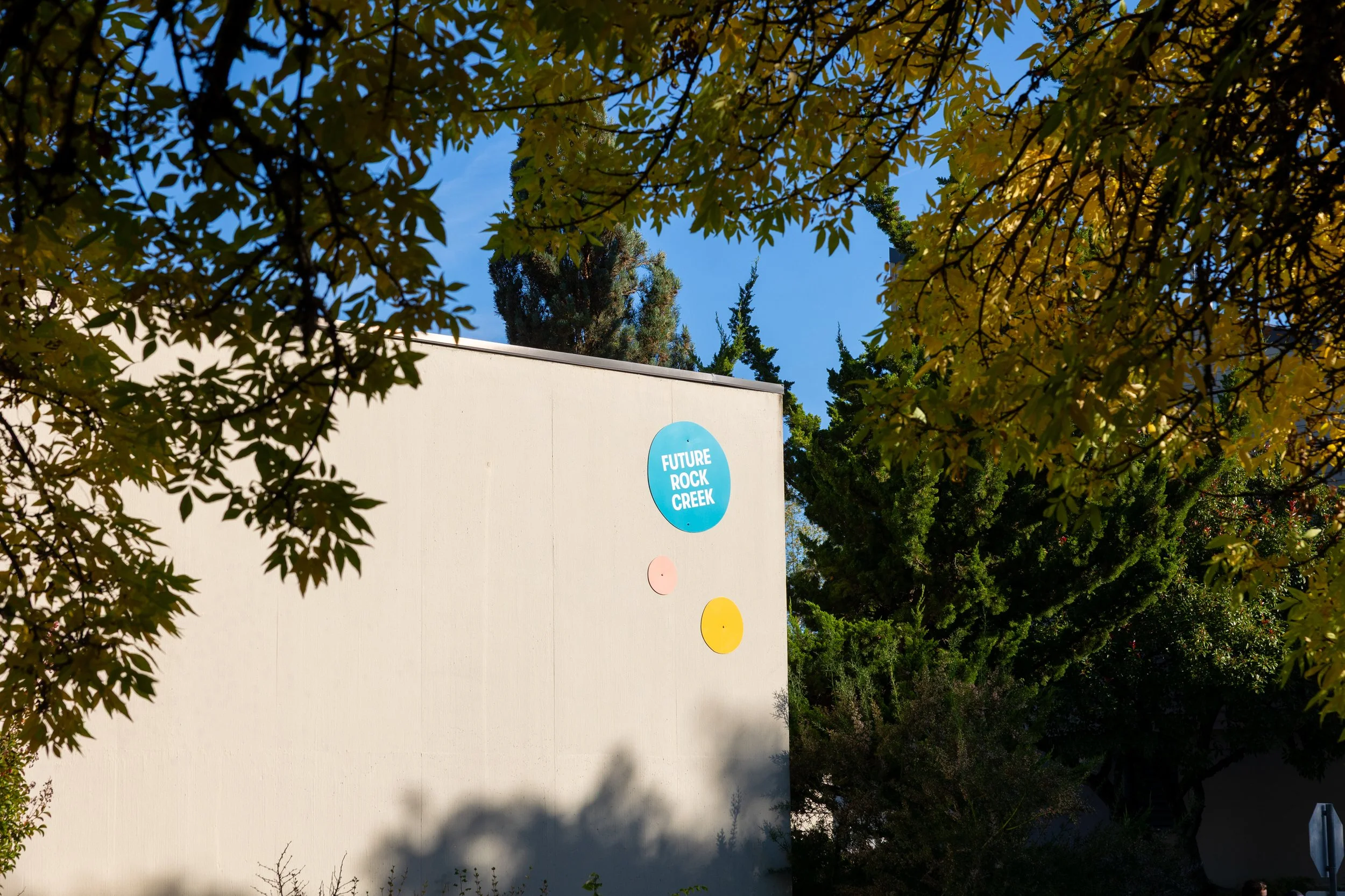
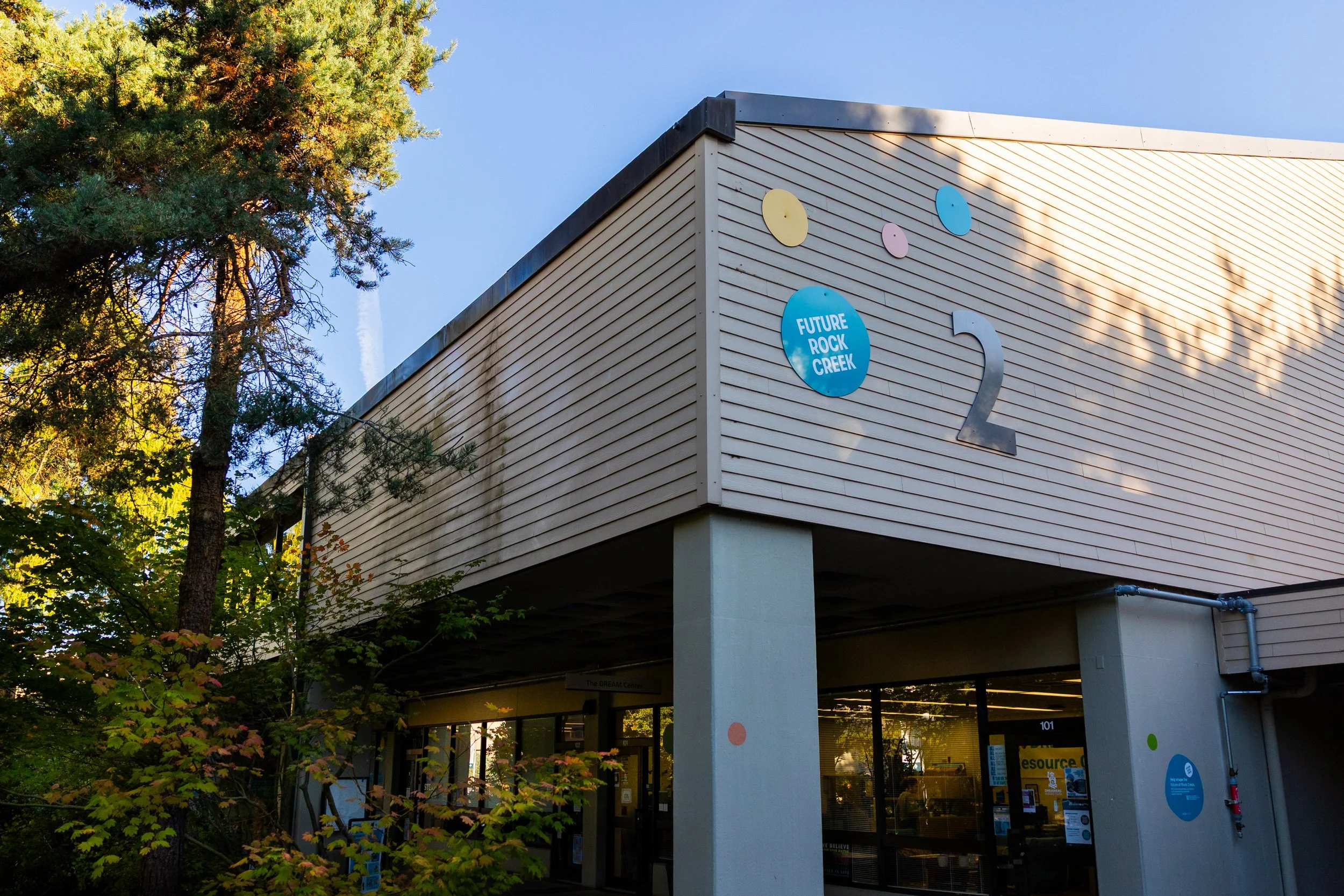
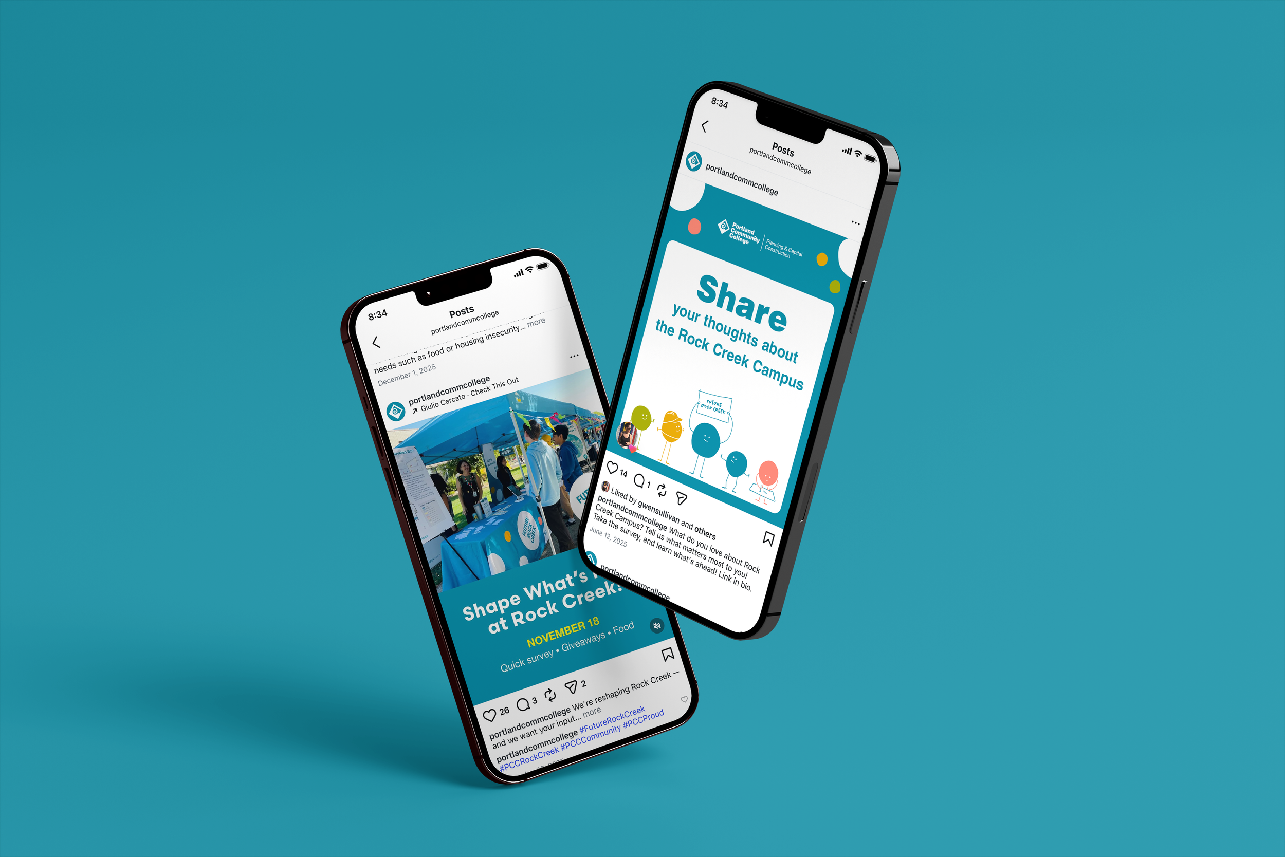
From the naming of the project to the branded graphics and project mascot, Future Rock Creek brings together students, staff, administration, and the design team to establish trust and transparency in the process.
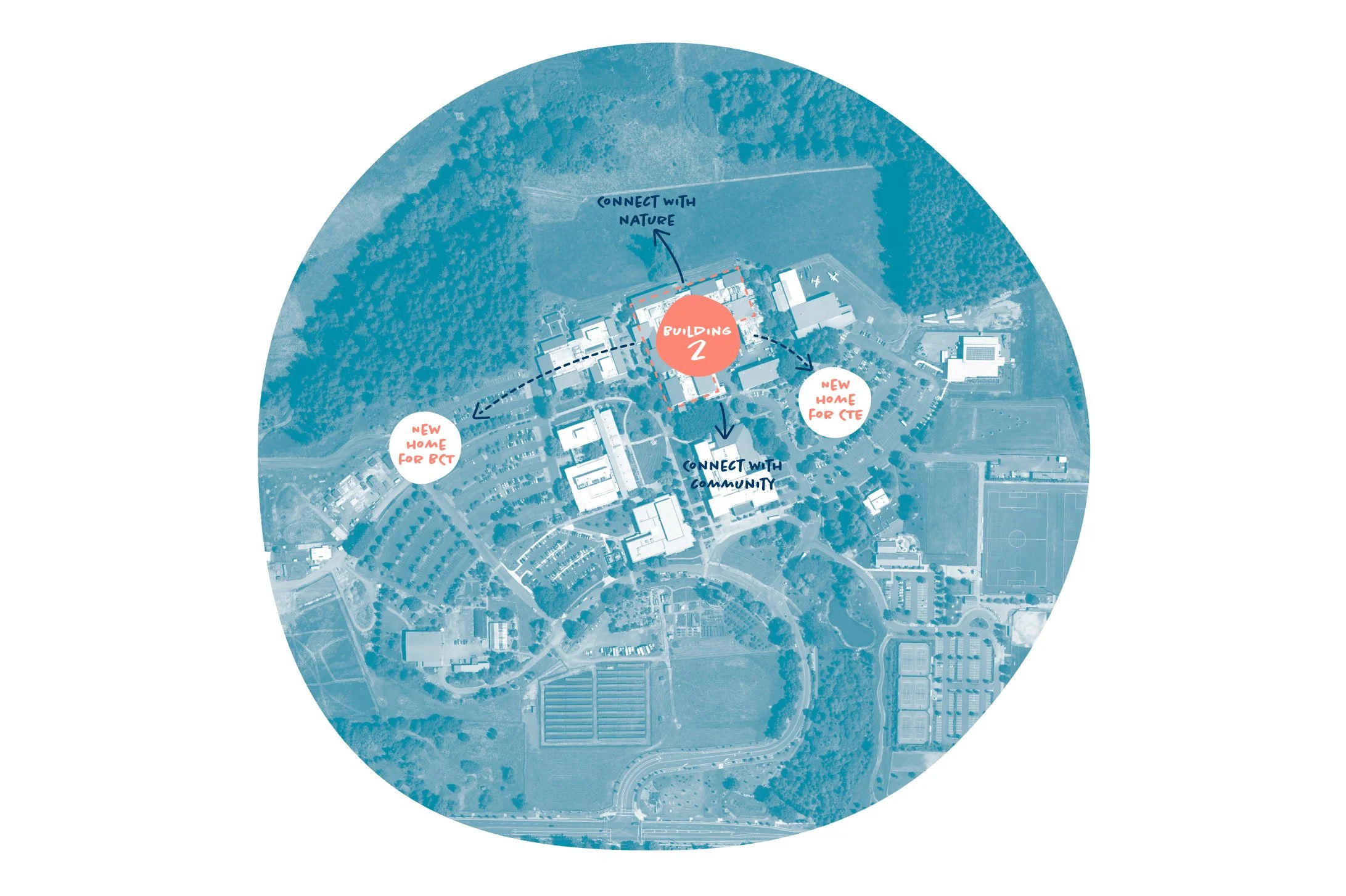

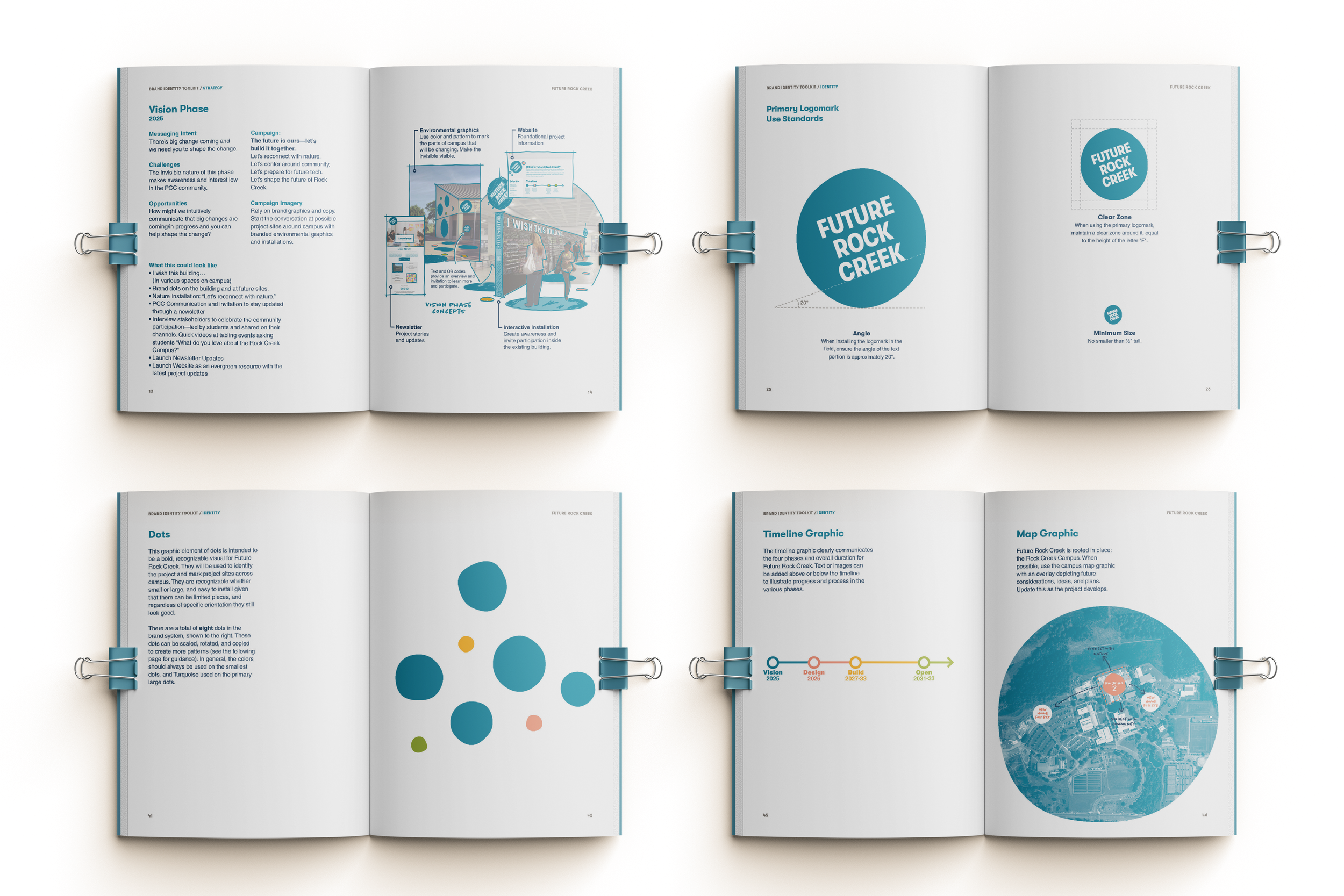
We created a brand toolkit to enable the diverse project team—from PCC staff to consultants—to communicate with consistency and confidence across channels.
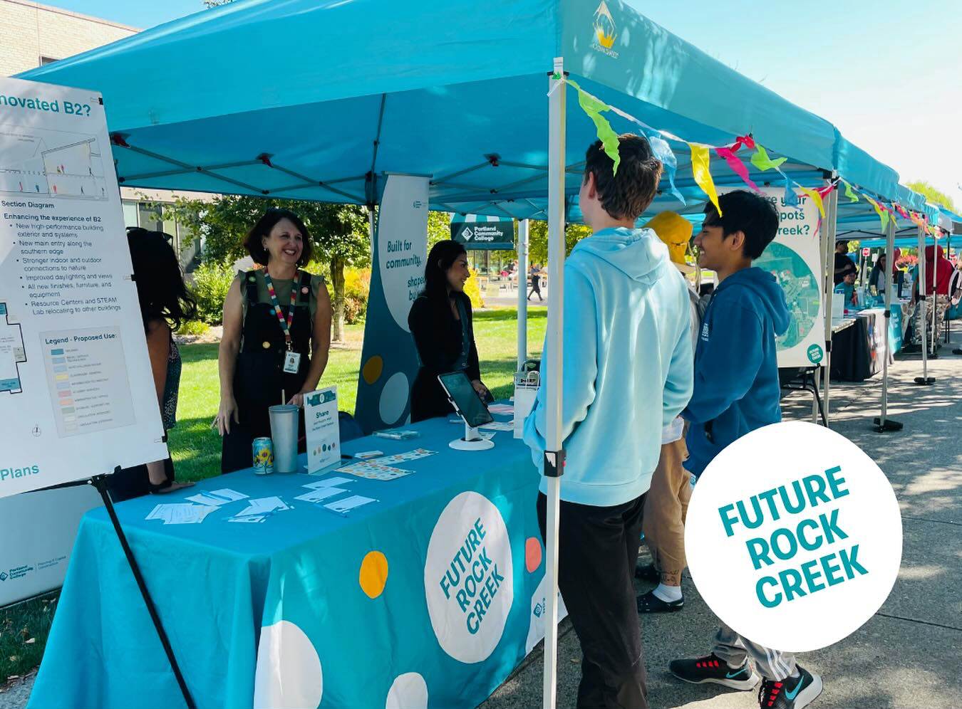
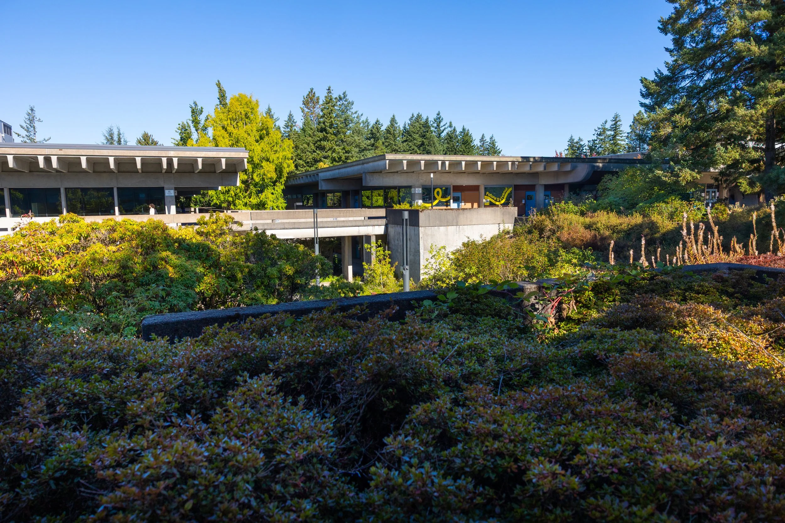
Following the success of the Rock Creek project, staff for the Sylvania Campus transformation asked us to work with them on a similar effort.
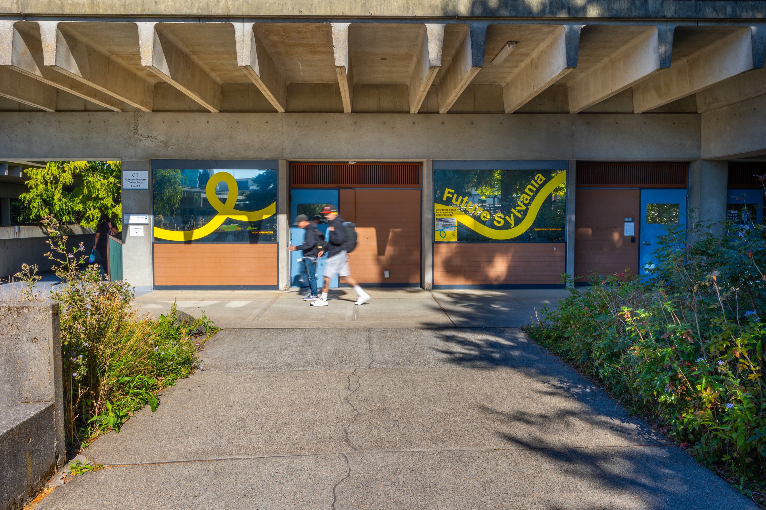
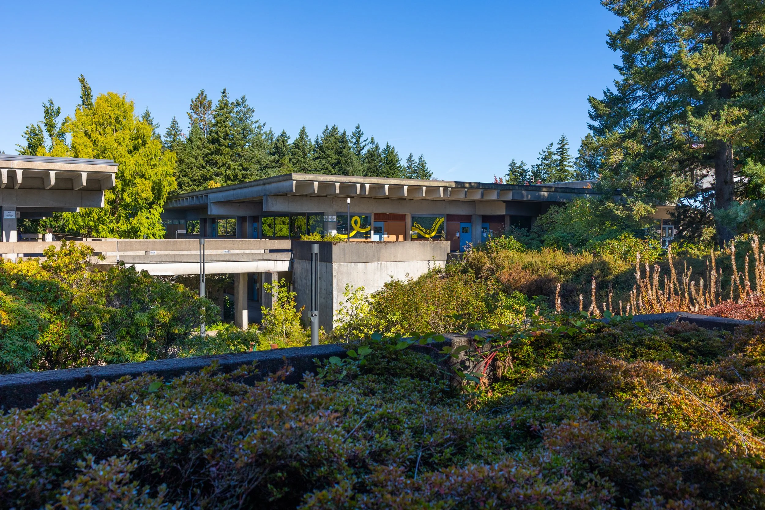

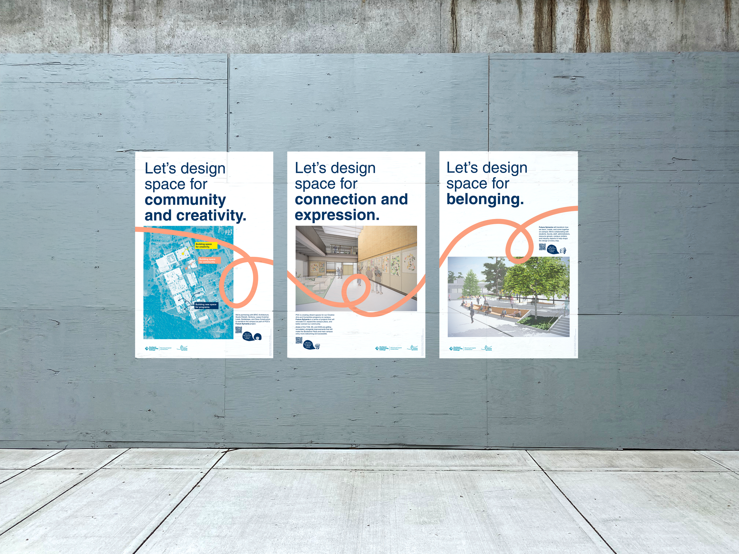
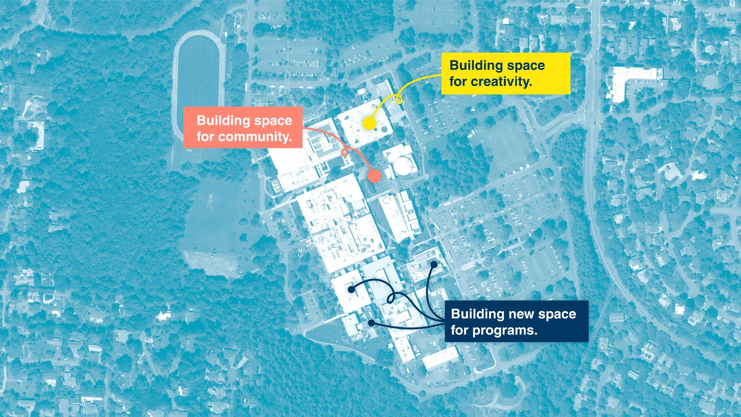
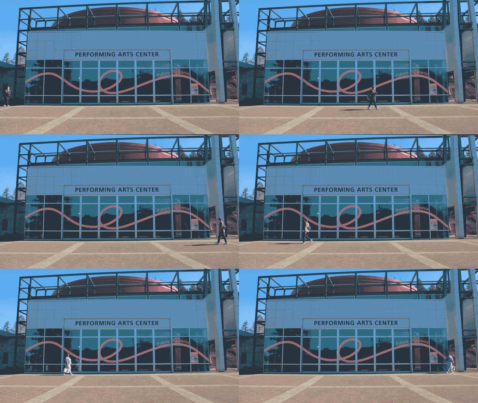
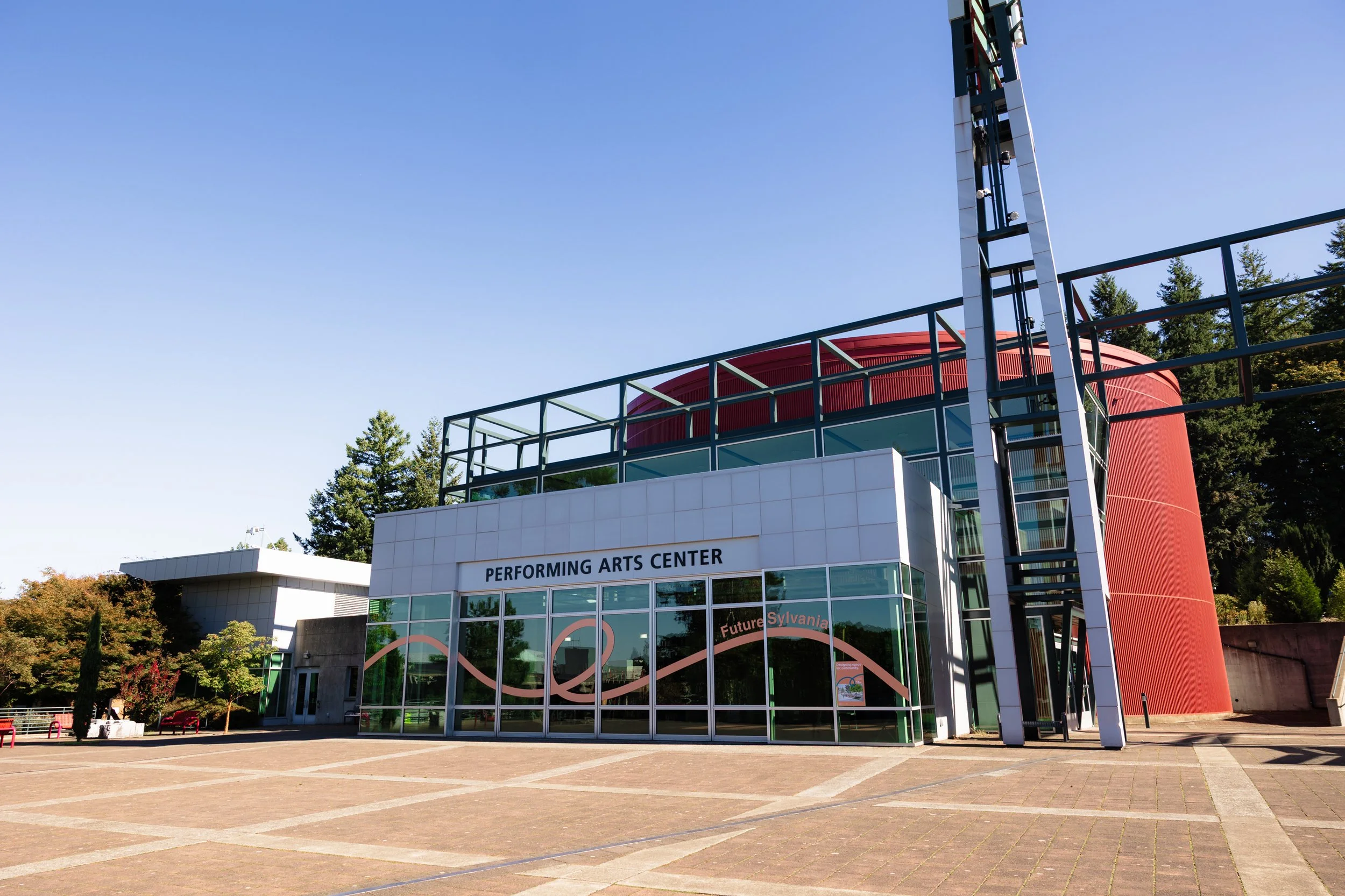
We created a graphic identity that leverages bold, colorful “threads” to represent the connections that the new projects will create across campus.
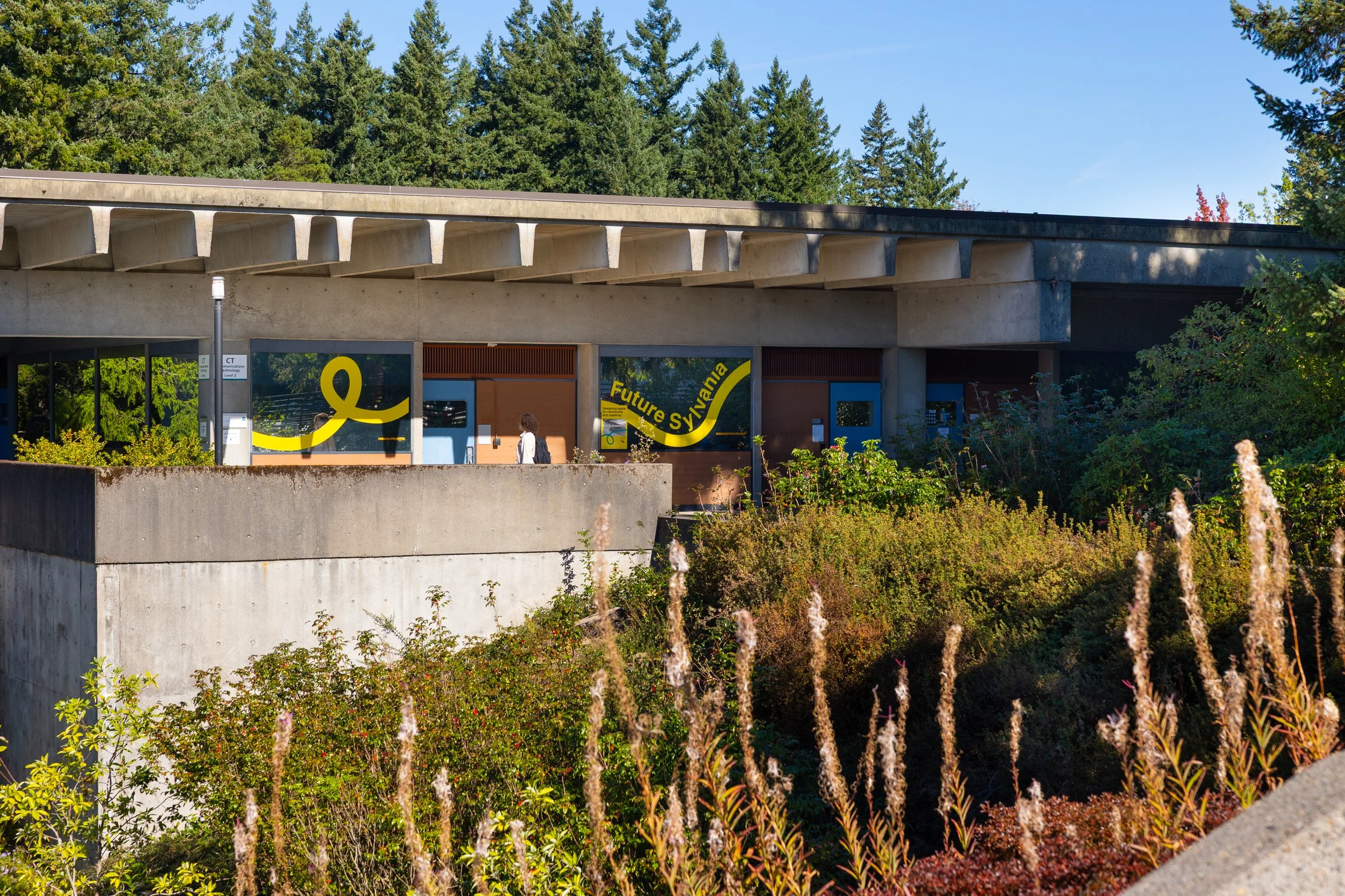
The graphics appear across campus, marking areas that will be impacted by the new projects. Their scale and color enable them to stand out against the brutalist architecture.

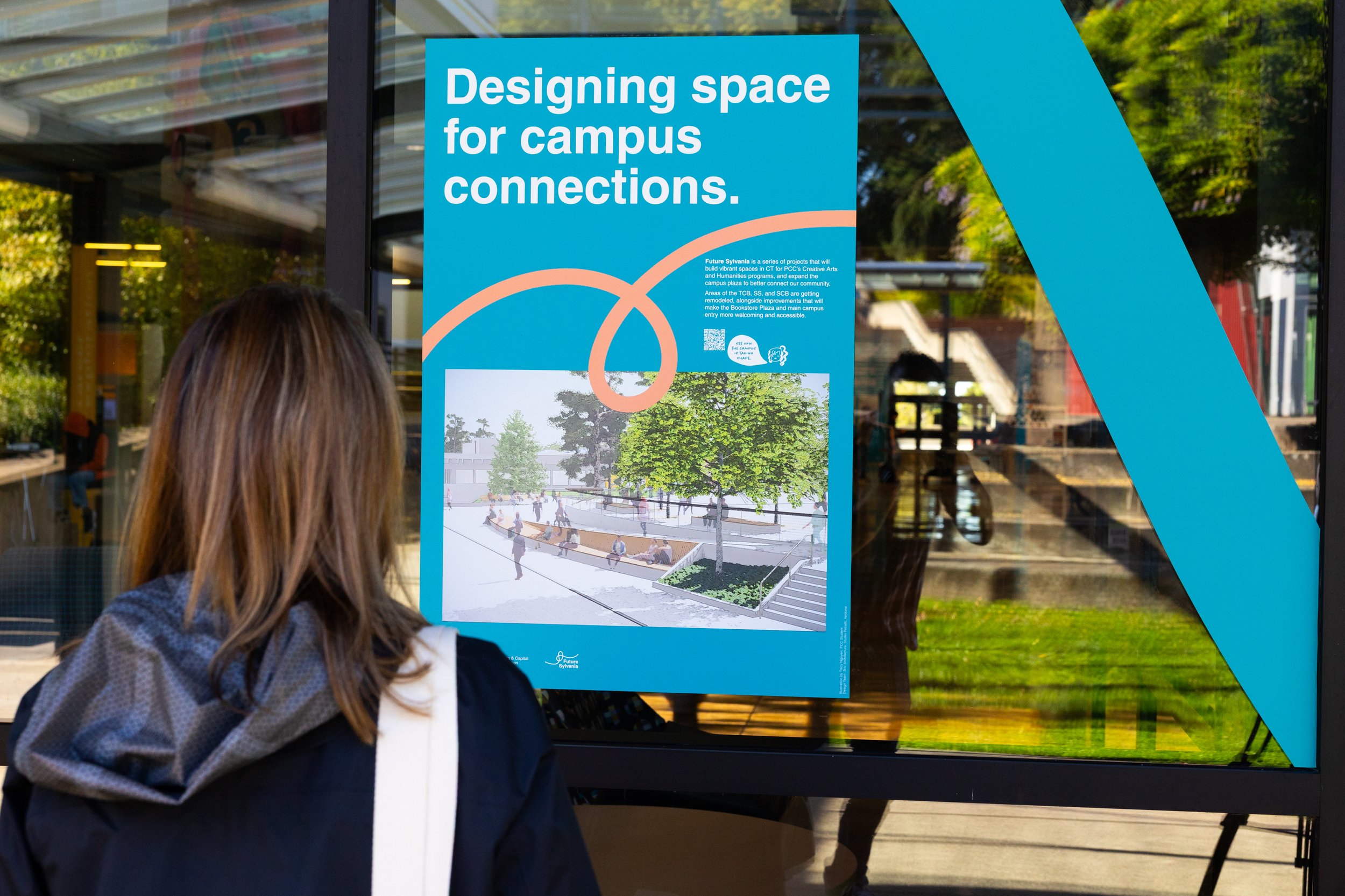

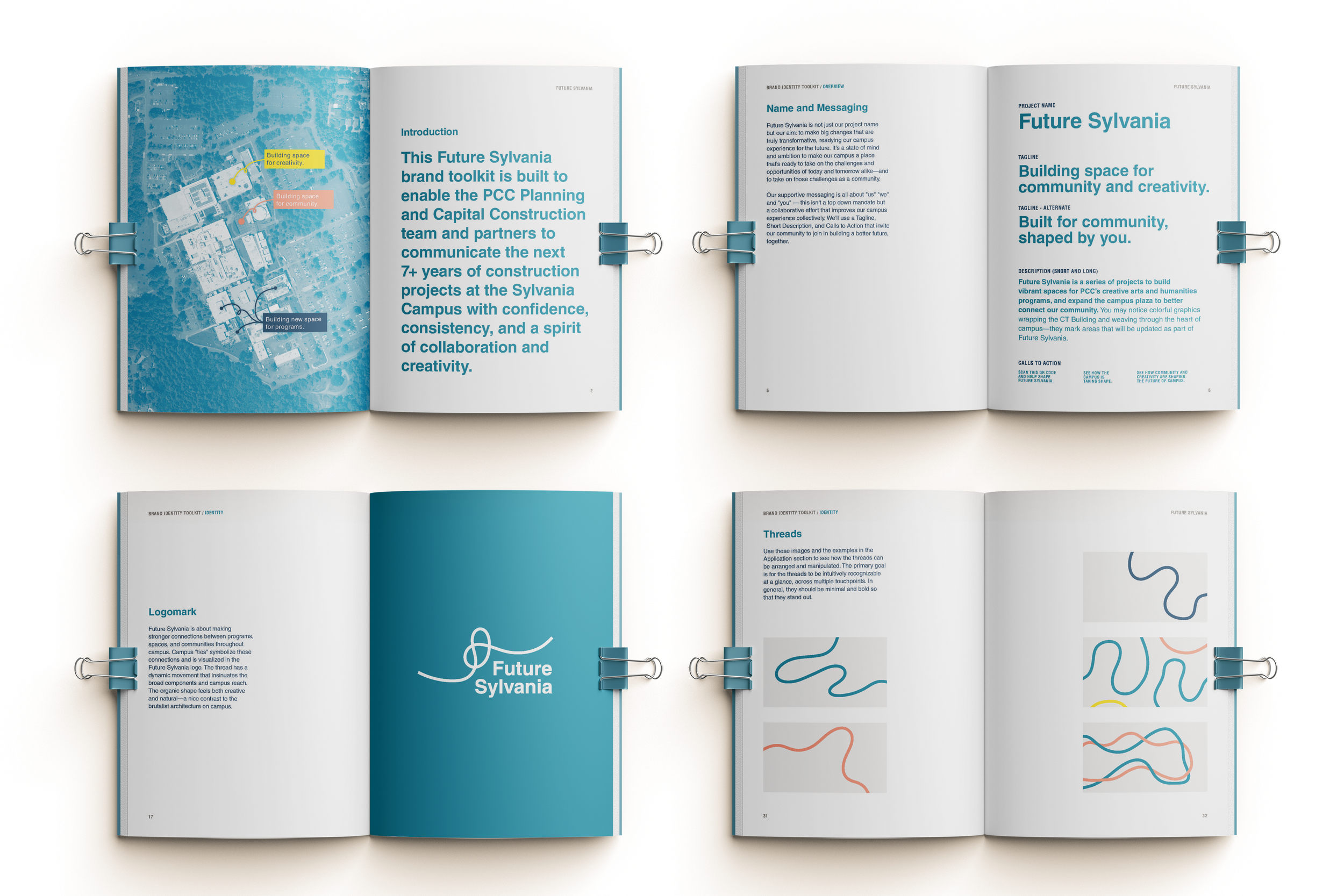
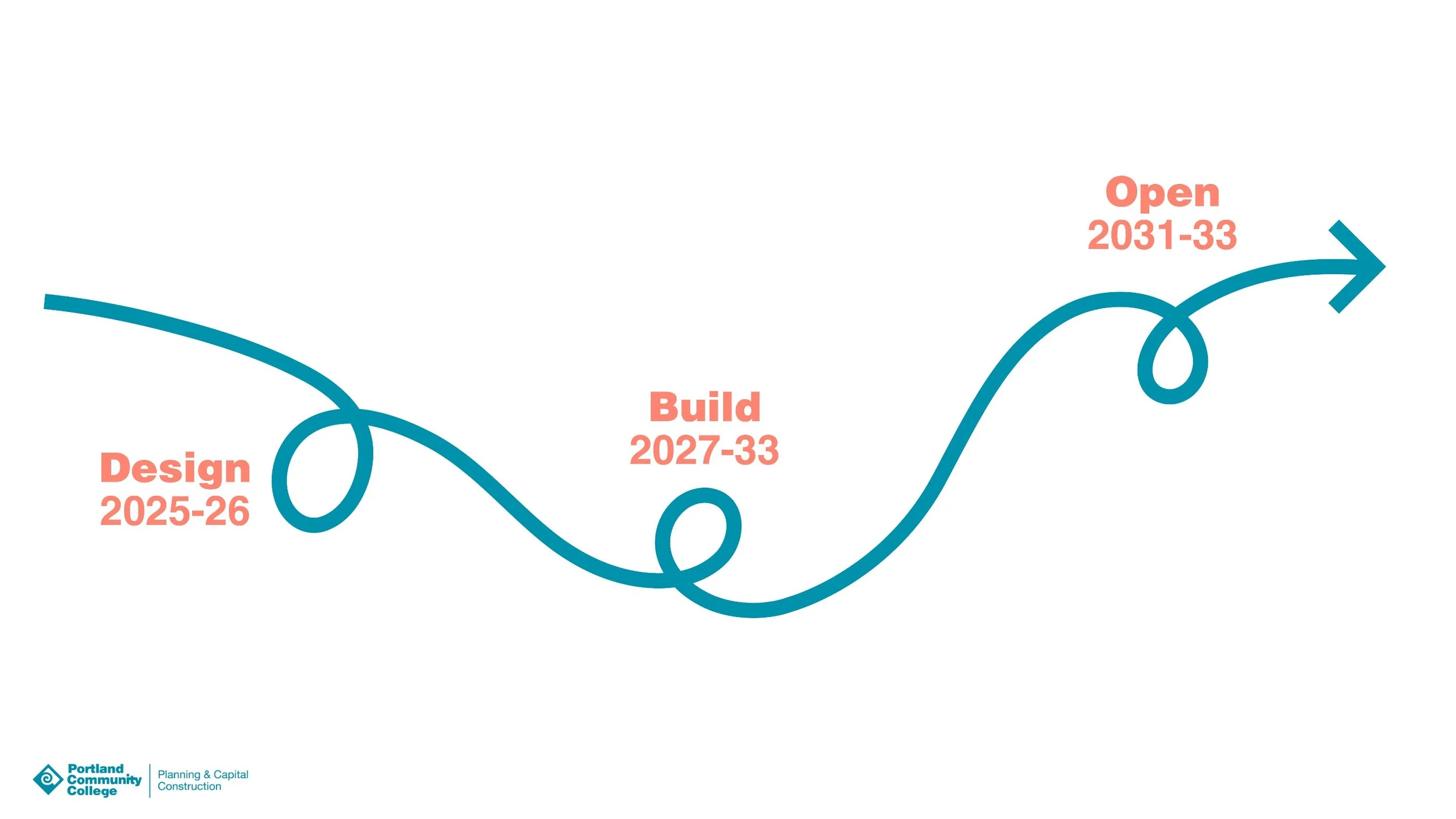
A brand toolkit and messaging strategy guides communications throughout the 7+ year design and construction process.