

Data Visualization / Infographics / Graphic Design
Over the past decade, we’ve explored how people move around cities—from bicycles to skateboards. Data visualization enables us to uncover unique insights and patterns that have helped shape policy for many transportation projects and initiatives including Vision Zero.
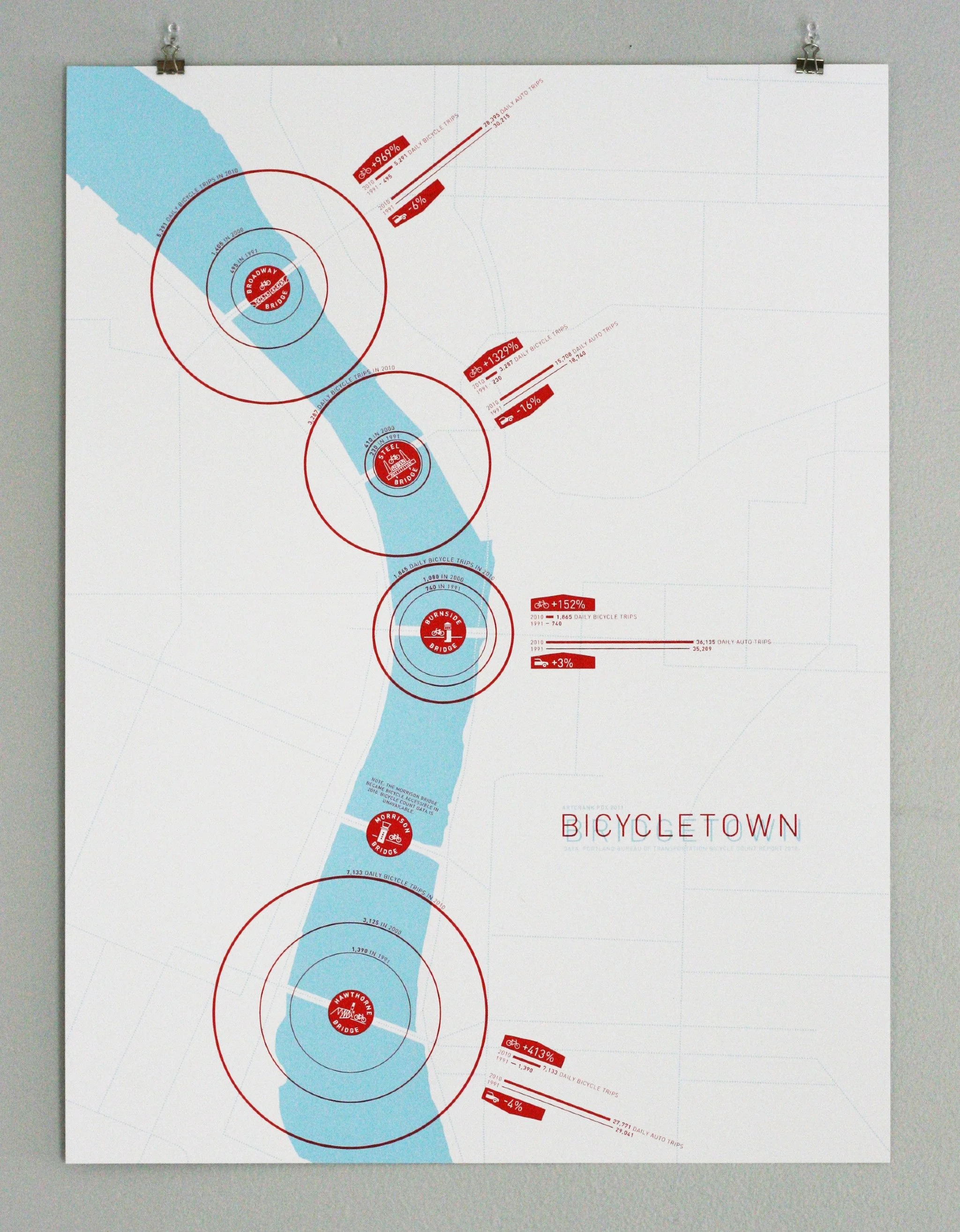
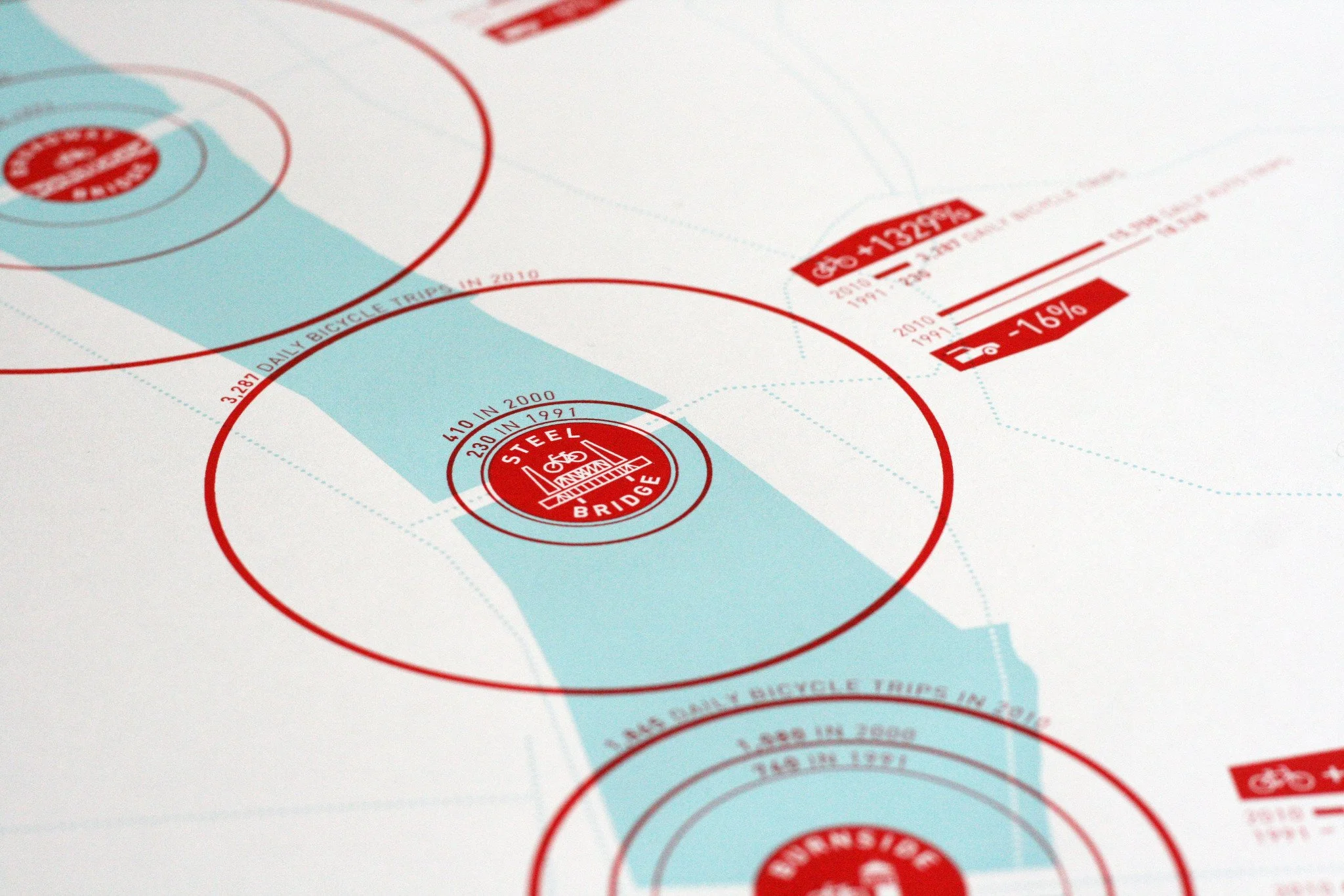
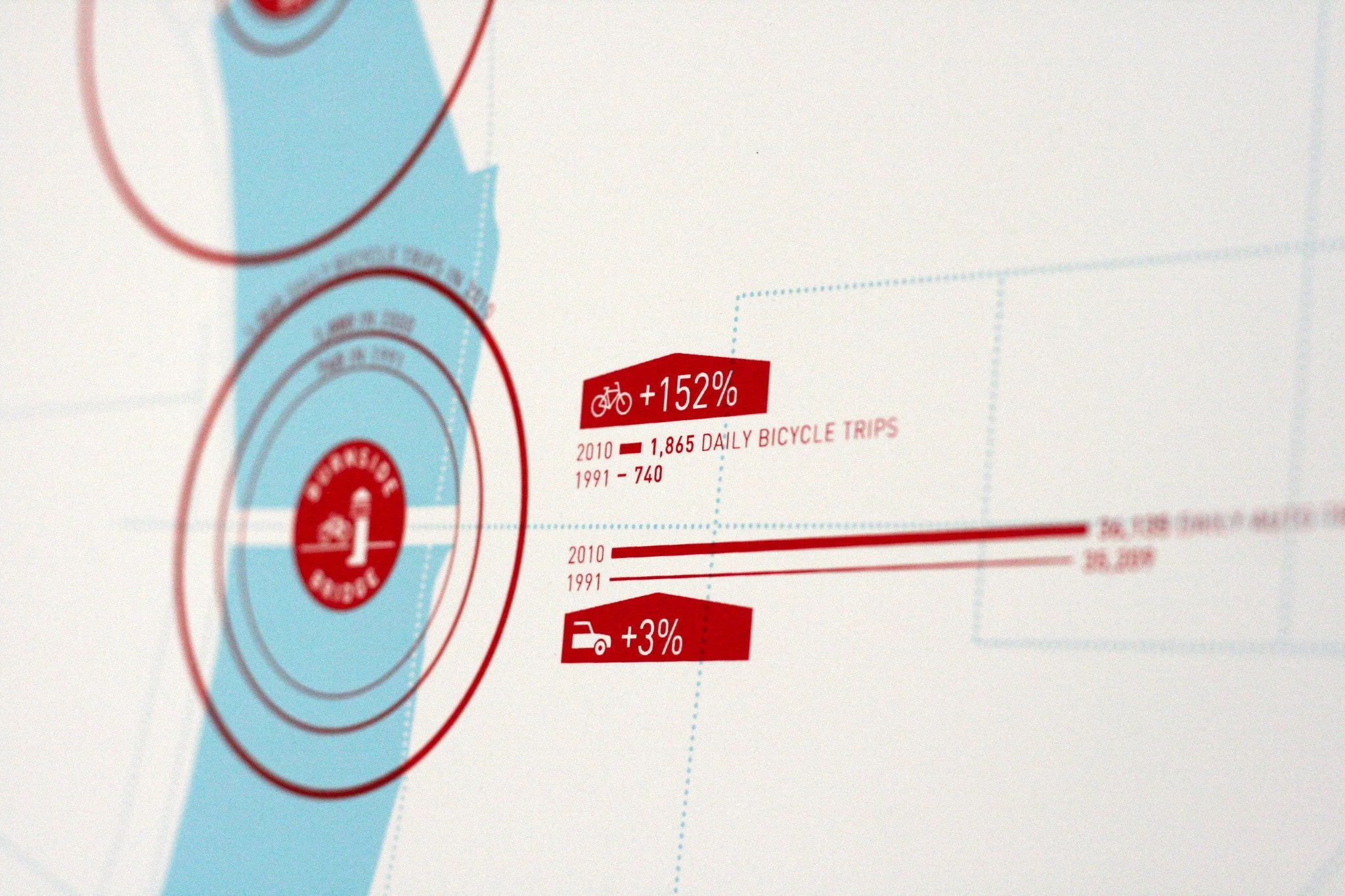
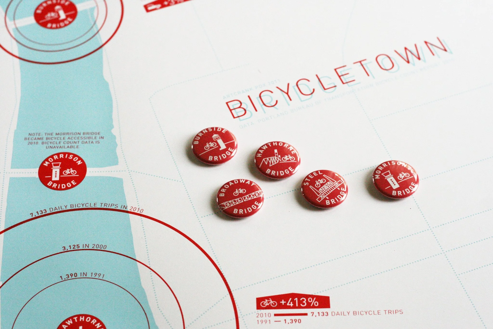
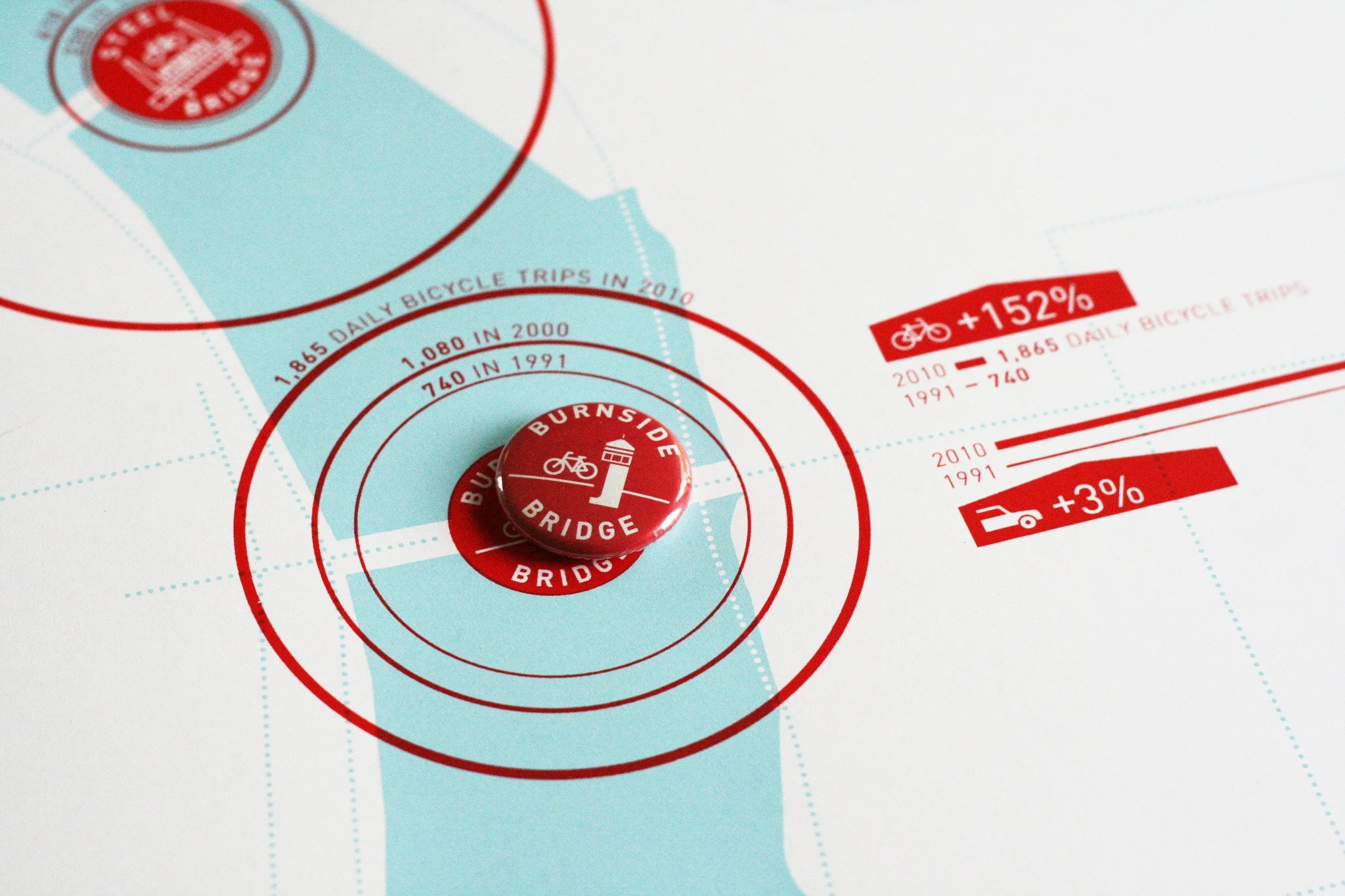
Bicycletown/Bridgetown
Portland's bridges are among the busiest bicycle routes in the city. The Bureau of Transportation has conducted bicycle counts for the Broadway Bridge, Steel Bridge, Burnside Bridge and Hawthorne Bridge since 1991.
This map displays data from the bicycle counts in order to compare the ridership levels between bridges, show growth in ridership over the past two decades and to show changes between automobile and bicycle use of the bridges.
In addition to the data-driven characteristics of the graphic, we also created a series of logos for each bridge. They are incorporated into the poster and also produced as buttons.

Active Transportation Atlas
North American cities collect and analyze large quantities of vehicle traffic data—but very little data pertaining to active transportation, such as walking and cycling.
As communities increasingly struggle with automobile congestion, climate change and chronic disease—active transportation is growing into a critical component of urban transportation networks. Therefore, it is becoming necessary to better understand how active transportation systems function and how they can be improved.
This publication, designed for the Portland Bureau of Transportation, features maps, data visualizations and illustrations describing the current state of active transportation in Portland. The content includes data and observations describing how Portlanders move throughout the City on foot and by bicycle.


Bicycle Count Map
What does a city look like if we visualize only the cyclists? This map shows daily bicycle counts at several hundred locations throughout the City of Portland.
Each count is marked by a circle; its area represents the number of daily cyclists. The circles are connected using a modified Delaunay triangulation in order to suggest cyclist movement throughout Portland. The triangulation was adjusted to remove connections between points that are not physically connected, such as those crossing the Willamette River at locations that do not offer a bridge.
The map invites speculation and interpretation. It describes several of the most-traveled routes such as the Springwater Trail corridor and the North Williams route. Areas that are seldom used or under-served by bicycle infrastructure, such as outer-east Portland, are also revealed.

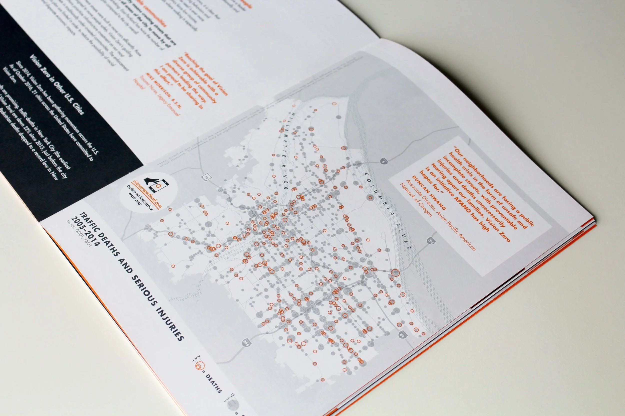
Vision Zero
We worked with the City of Portland for over a year in a uniquely collaborative relationship that involved using graphics, maps and visual analytics to study traffic crash data in the City.
Throughout the process, we created maps and data visualizations—using them to better understand data spanning ten years. The graphics were also a critical tool in communicating with the public—many of whom (particularly in areas most affected by traffic violence) do not speak English.
In addition to creating the maps and data visualizations, we designed a graphic-identity program and a richly-illustrated publication that was distributed throughout Portland. The publication integrated text and image into a compelling narrative that defined Vision Zero, explained why Portland needs it and described the actions that the City will take.


Bicycle Cities
This data visualization features three of the world's top cycling cities drawn to the same scale.
Each map includes the respective city's hydrological features (to provide orientation) and the cycling network. The cycling network shows all bicycle routes that are physically marked, including bicycle lanes, cycle tracks, bicycle boulevards and off-street bicycle paths.
The aim of this project is to encourage comparisons and speculation about similarities and differences between the cycling networks (and bicycle cultures) in these cities.


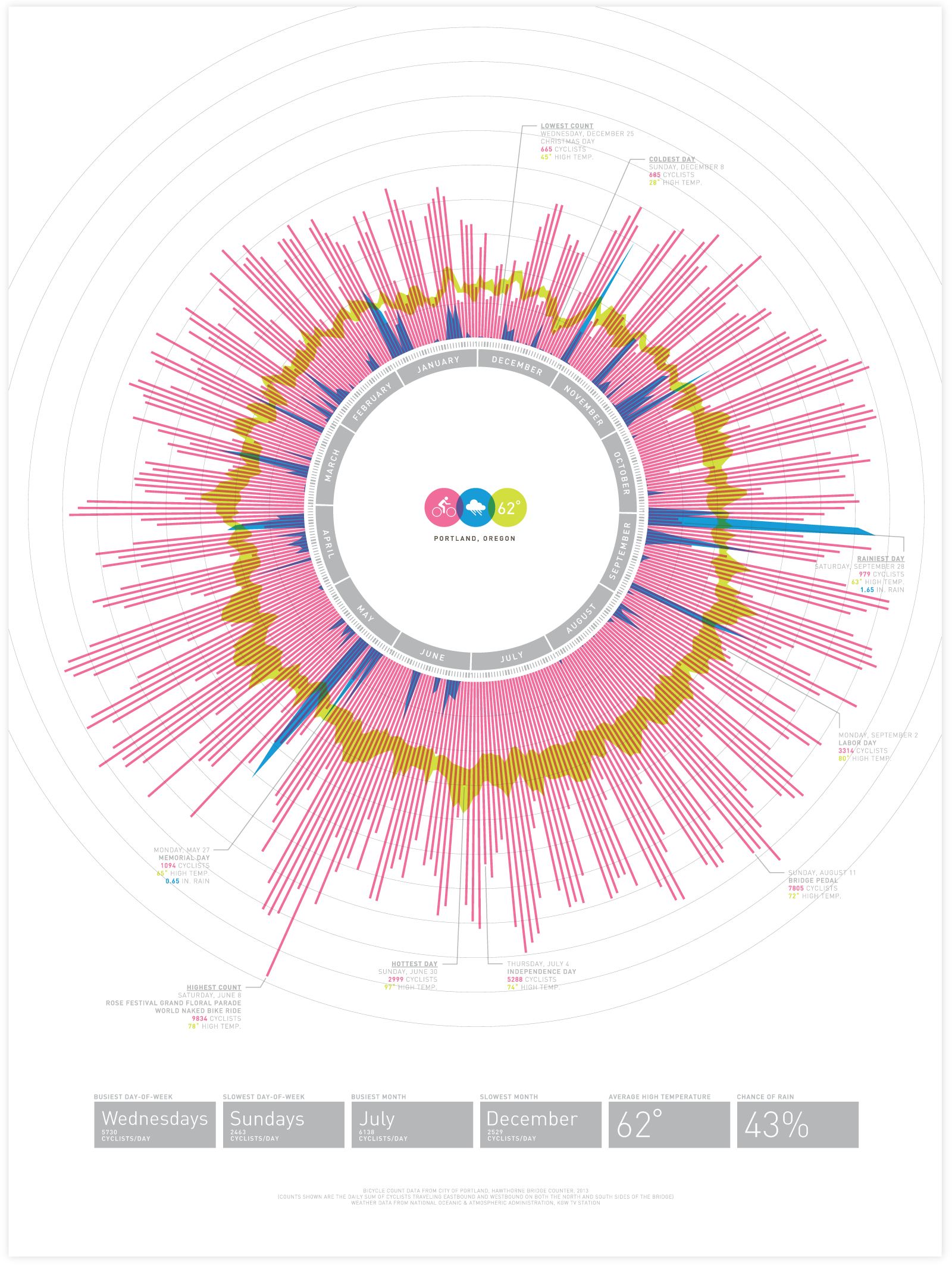
Bicycle Barometer
This data visualization presents an analysis of daily Portland bicycle counts, precipitation totals and high/low temperatures.
The data visualization invites speculation and interpretation about relationships between bicycle counts, weather and specific dates (and events that took place throughout the year).


